


For paint manufacturers, coating companies, OEMs and paint brands, colour selection is rarely just a visual exercise. A sales team may show a shade on a laptop, a customer may compare it on a phone, while production and QC teams work with physical samples. The colour may appear similar across all three, yet the approval process can become uncertain when everyone is viewing it in different conditions.
This is why digital vs physical color matching has become an important B2B consideration. Digital tools have made colour visualization, sharing and remote communication faster. Yet professional shade cards and fandecks continue to play an important role in sales, customer approval and colour management.
The practical answer is not digital versus physical. It is using each where it adds the most value: digital for speed and communication, physical references for comparison, presentation and decision confidence.
Digital Color Matching: Where It Works Best
Digital color matching is valuable when speed and accessibility matter. Sales teams can share colour options remotely, product teams can communicate ideas quickly, and customers can review preliminary selections without waiting for a physical meeting.
For businesses with multiple teams or locations, digital tools can simplify communication between sales, product development, technical teams and customers. They are useful for preliminary shade exploration, digital presentations, shortlisting options and keeping colour information accessible.
This makes digital tools particularly useful at the beginning of the buying journey. A customer can explore a wider range of options and narrow down choices before reviewing a physical reference.
Digital tools are therefore highly useful for speed, visualization and communication. The question is whether they should also become the only reference for an important B2B colour approval.
Why Digital Color Alone Can Create Challenges in B2B Sales
A colour displayed on a phone, monitor or tablet can appear different depending on the screen, brightness, settings, surrounding light and viewing conditions. This does not make digital color matching ineffective, but it does mean that a digital representation should be understood in the context of how it will be used.
There is also a practical business issue. Colour approval is often collaborative. A sales executive, dealer, customer, production team and QC professional may all need to discuss the same shade. A digital image can start that conversation, but a physical reference can make the discussion more tangible.
For preliminary selection and remote communication, digital tools can be extremely convenient. For important customer approvals, however, a physical shade comparison can provide another level of clarity and confidence.
Why Physical Shade Cards Still Matter
Professional shade cards turn colour selection into a tangible business conversation. A customer can physically compare shades, discuss alternatives with a sales representative and refer to the same sample during an approval discussion.
For paint manufacturers, a shade card can therefore be much more than a collection of colour samples. It can become a sales and communication tool.
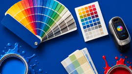
A well-organized fandeck can help sales teams present an entire colour portfolio professionally, while structured shade cards can give dealers, customers and internal teams one consistent physical color reference.
This becomes particularly useful when colour information moves between departments. Sales may use the reference for customer discussions, production may use it to understand the approved shade, and QC may refer to it during inspection. A physical reference does not replace technical colour measurement or production controls, but it can support clearer communication across the workflow.
Xtreme Colors itself positions shade cards, fandecks and colour-matching tools around practical B2B uses, including customer selection, sales support, consistency and colour communication.
5 Reasons Shade Cards Still Win in B2B Sales
1. Tangible Customer Experience
Physical colour swatches give customers something they can hold, compare and discuss. In a sales meeting or dealer environment, a professional shade card can make colour selection more concrete and help customers narrow down their choices.
2. Better Sales Conversations
A sales representative can use a professional shade card or paint fandeck as a structured presentation tool. Instead of sending isolated digital images, the salesperson can guide the customer through related shades, alternatives and product ranges. This makes dealer and B2B sales conversations more organized.
Xtreme Colors describes professional shade cards as sales tools that can help improve customer confidence and support faster purchase decisions.
3. Stronger Color Approval
Physical shade cards can support the customer color approval process by giving the buyer and seller a shared reference. When an approved physical sample is retained, teams also have something tangible to refer back to during subsequent discussions. Where exact production tolerances are required, this should still be supported by appropriate technical controls.
4. Better Internal Alignment
A consistent physical reference can help connect sales, customers, production and QC. Instead of different teams working from screenshots, individual samples or memory, they can refer to the same organized shade card or fandeck. This can make the color approval process easier to communicate.
5. Stronger Brand Presentation
A professionally designed shade card communicates more than colour. It represents how a paint brand organizes and presents its product portfolio. Consistent colour communication across shade cards, products and batches can strengthen brand identity and customer trust. Xtreme Colors’ existing B2B content similarly emphasizes brand consistency and professional colour communication.
Digital + Physical: The Smarter B2B Color Strategy
The strongest approach for many B2B businesses is not choosing one system and ignoring the other.
A practical workflow can look like this:
DIGITAL EXPLORATION → SHADE SHORTLIST → PHYSICAL SHADE CARD / FANDECK → CUSTOMER APPROVAL → PRODUCTION / QC REFERENCE
Digital tools make it easier to explore options, communicate remotely and share information quickly. Physical shade cards then provide a tangible reference for important comparisons, presentations and approvals.
This connected approach can work particularly well for paint manufacturers, coating companies and OEMs with sales teams, dealer networks or multiple operational locations.
Xtreme Colors’ guidance on reducing colour rejection similarly highlights the role of accurate shade cards and fandecks in customer selection and B2B colour communication.
How to Build a Better Color Reference System
Start by identifying where your business needs digital speed and where it needs a physical reference.
Standardize the physical references used by sales, dealers, production and QC. For a broad colour portfolio, develop professional shade cards or fandecks that organize shades clearly and make comparison easy.
Use digital tools for remote communication and preliminary selection, but use physical references for important customer approvals and key product decisions.
Maintain an organized shade library and establish a consistent method for communicating approved colours across products and batches. The objective is not simply to produce more samples. It is to build a repeatable color reference system that supports sales, product development, customer approval and quality control.
For businesses with expanding product ranges, this becomes even more relevant. More shades, products, teams and locations create more opportunities for communication gaps. A structured colour-reference system helps bring those moving parts together.
What Should Paint Manufacturers Choose?
The answer is not to replace digital color matching with physical color matching.
Use digital tools where speed, visualization, remote access and fast communication are the priority. Use professional shade cards and fandecks where tangible comparison, sales presentation, customer approval and consistent physical referencing matter.
For B2B sales, the most practical model is often a connected digital and physical color-reference workflow.
Digital helps teams explore and communicate. Physical references help teams present, compare and approve.
Conclusion
Digital tools have changed how businesses communicate about colour, but they have not eliminated the value of professional physical references.
For paint brands, coating manufacturers and OEMs, shade cards and fandecks continue to support customer conversations, sales presentations, colour approvals and communication between sales, production and QC. Their value is not simply that they show colour. It is that they turn colour into a tangible business reference that multiple people can discuss and use.
Digital can show the colour. A professional physical reference helps teams make decisions around it.
Xtreme Colors provides professional shade cards, fandecks, colour swatches and colour-matching tools for B2B businesses that need structured and professional colour communication.





0 comments
Write a comment